
Software license data without visualization is an archive. It records what happened. It does not make the pattern visible, and it does not prompt action. The difference between an organization that acts on its license data and one that simply collects it is almost always a question of how that data is presented.
A table of software license checkout records from the past 90 days contains the same information as a heat map of that same data. But one of them produces a question. Why is Thursday morning consistently saturated? And the other does not? The specific dashboard views that matter for software license reporting are not interchangeable. Each one surfaces a different dimension of the utilization picture and supports a different category of decision.
Walk through the key dashboard views in LAMUM and what each one is actually built to tell you.
The Current Overview: Your Operational Pulse
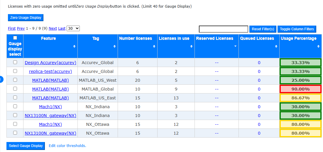
The current overview table is the operational dashboard. It shows active software license usage across all monitored tools, with utilization percentages color-coded by intensity. Red entries signal pools at or near saturation. Green entries have available headroom.
The value of a live view is that it makes saturation visible before engineers start filing complaints. A pool sitting at 95% utilization with zero queued requests is one checkout away from a denial event. The current overview makes that visible to the administrator at the same moment it is happening.
The Concurrency Graph: Capacity Planning in a Single View
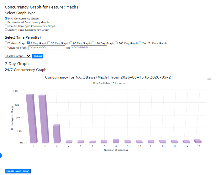
The concurrency graph plots simultaneous license usage over a selected time window. Its most useful application is the comparison view – running 24/7 utilization alongside a business-hours filter and reading the gap between them.
Now, that gap tells you two things. If utilization during business hours consistently approaches the pool ceiling while off-hours utilization drops sharply, you have a genuine capacity problem concentrated in predictable windows. If utilization is high across most of the day but clears at specific times, you may have a checkout duration problem rather than a capacity one, and the right response is policy rather than procurement. Both interpretations come from the same data.
The Heat Map: Finding the Pattern Behind the Problem
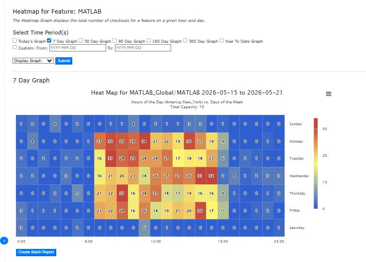
A heat map of license checkout density shows utilization across every hour of every day in the selected period, color-coded from low activity to peak demand. Dark red cells identify the exact hours and days where license pressure is highest. Blue cells identify the idle windows.
For multi-site or hybrid engineering environments, the heat map reveals whether peak demand windows in different geographies overlap or complement each other. Two sites with non-overlapping peak hours sharing a license pool are a fundamentally different optimization problem than two sites whose peaks coincide. The heat map is also the fastest way to answer the question finance always asks: when are the licenses actually being used?
The History Graph and Average by Tag: The Renewal Conversation
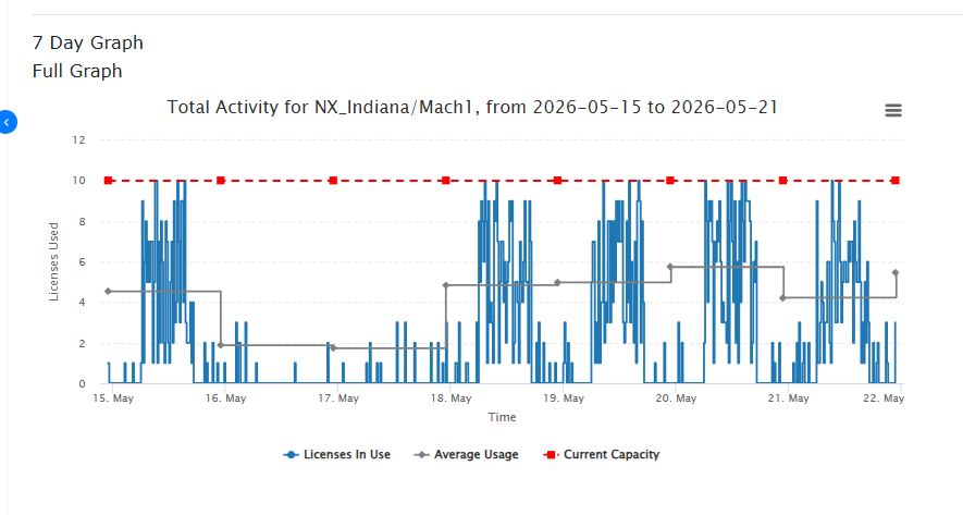
The history graph plots software license consumption over an extended period, showing the rolling average alongside actual usage and the licensed capacity ceiling. The average by tag report complements it by showing, for a specific tool or feature, the percentage of time the pool ran at full capacity and how many times it hit the ceiling during the selected window.
These two views together form the data package for a vendor renewal conversation. Suppose when a vendor proposes renewing at the current volume, an organization with a history graph showing 55% average utilization and an average by tag report showing the pool hit its maximum only 12 times in the past year has a defensible basis for a reduction request. Without that data, the conversation defaults to the vendor’s proposal.
The Zero Usage Report: The Most Underused Dashboard in License Management
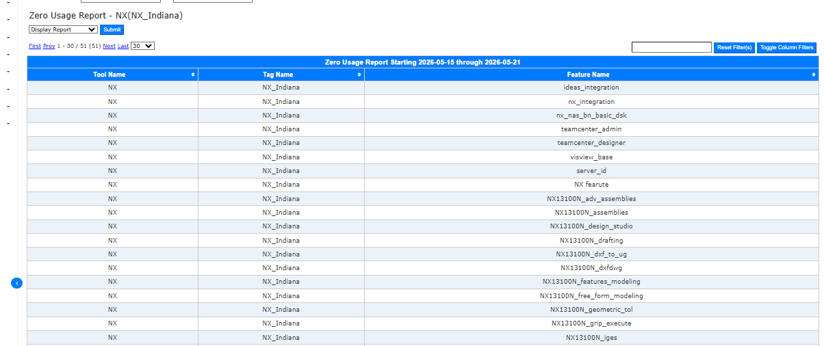
The zero usage report lists every feature and tool that recorded zero checkouts during the selected period. Run it against a 365-day window and it identifies the licenses renewing on autopilot with no utilization to justify them. For organizations that have not run this report before, the results are consistently surprising:
- Features included in a bundle purchase years ago that the team never used
- Tools provisioned for a project that completed and were never deprovisioned
- Add-on modules whose original user left the organization
They all appear in the same list, with a direct line to the renewal cost they represent.
From Reporting to Decision
A license administrator who can show a finance leader a heat map of peak demand windows, a concurrency graph demonstrating checkout duration patterns, and a zero usage report identifying $180,000 in non-renewing candidates is not presenting a report. They are presenting a strategic business decision.
LAMUM’s full dashboard suite gives license administrators and IT leaders the specific views that turn software license data into those decisions. Request a demo and bring your utilization questions. The answers are usually already in the data.

- IT Chargeback Clarity: How License Management Supports Cost Allocation - September 9, 2026
- LAMUM vs. Traditional Software License Tracking Tools: What You Need to Know - August 31, 2026
- Why 24/7 License Activity Reporting Matters for Engineering Teams - August 24, 2026